From closets to dining rooms, I’m wallpaper obsessed for Ramayana.

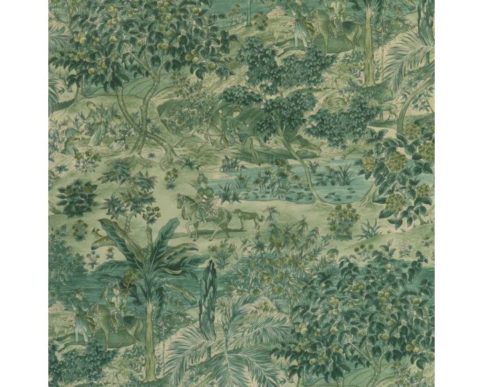
I’m officially in love with this wallpaper. It’s bordering on an obsession.

I am head over heels. It’s pretty full-on interior lust, but oh, seriously, what a statement this wallpaper could make. I can’t tell you how many times I wish I had another room to decorate when I see something like this. I itch to get my wallpaper pasting table out!

Ramayana Wallpaper by  G P & J Baker Signature II Wallpaper Collection

The obvious, of course, is to put this in the downstairs toilet which always deserves something special to delight the unexpected visitor and keeps their eyes rolling while doing their business.

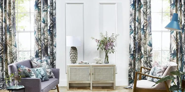
But I’m thinking bigger and better for this; if you’re going to pick something that makes a point, it shouldn’t always be hidden away in the loo. Dining room, tick. Fantastic in a dressing room, tick. For a DIY project you could decorate the back of a shelving unit, a new giant paper living room lampshade or use this to up-cycle a folding screen into something quite fabulous, tick. Bedroom, tick tick tick.

Let’s take a look at the colour combos and some key pieces that could make this shine.
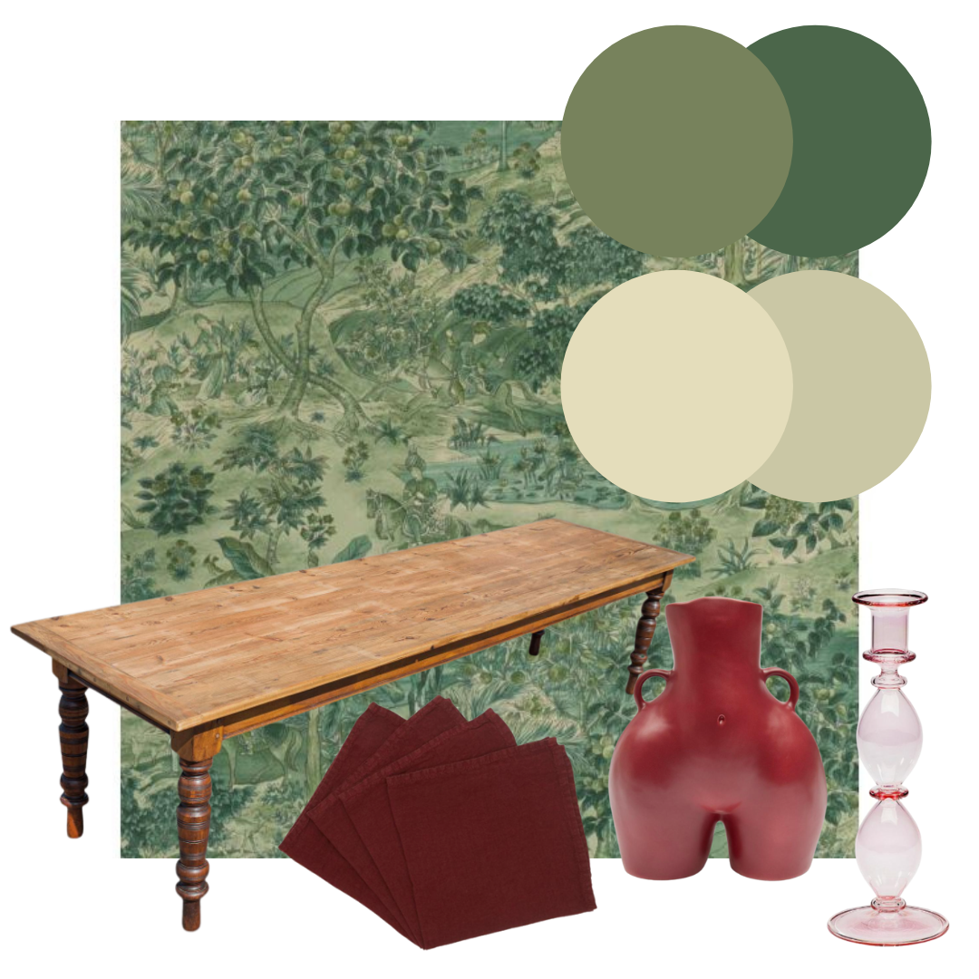
Dining room.

Use this wallpaper with a beautiful green ceiling and dark trim from Little Green – their Sage and mid-Brunswick greens go beautifully – to create a really cosy eating space. Or if you want to add a bit more creaminess to the mix I love these two colours from Farrow-Ball the Skimmed-milk-white or Ash-grey would work really well. Paint the ceiling and trim the same lovely colour skimmed-milk-white with the skirting in the Ash-grey to take your eye up.

Add an amazing antique table – this one is a large antique farmhouse table, C.1900 from 1stDibs and is rather special but you can find others that bring in that sense of having been used for celebrations and dinners over the years.

Don’t forget a few lovely accent accessories to pull it all together. I’ve picked a few from Liberty: Linen napkins from Once Milano, a Love Handles Vase by Anissa Kermiche and a really soft red glass Olympia Glass candle holder by Anna & Nina. Red is always a great colour to touch a dining room with as it’s a colour of passion and what else could be much more passionate that fabulous dinners with friends and family. Good food and good company.
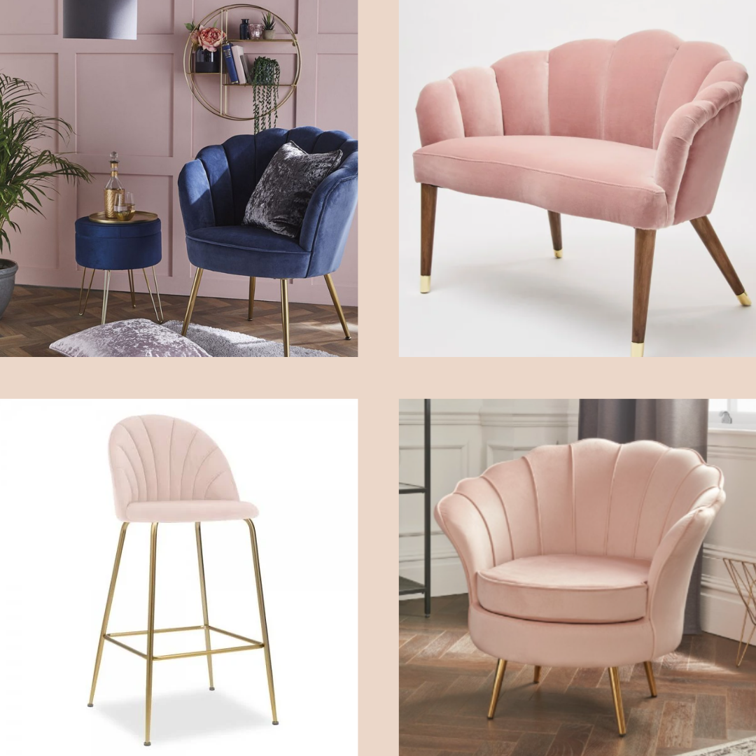
Dressing room

So I know most of us, at least in the UK, don’t have the luxury of a dressing room but one can always imagine. I do goo-goo over the large walk-in dressing room closets that are showcased across most of the USA house revamp shows and always wonder why they don’t add a little more than just the obligatory crystal chandelier and ballet pink poof or chaise lounge.

I know the clothes are the stars and a simple background helps them stand out but between the stark white shelves there is always a moment for a little va-va-voom. I think this wallpaper could be just the answer because it is so complex and yummy and can hold its own against a strong cold white.

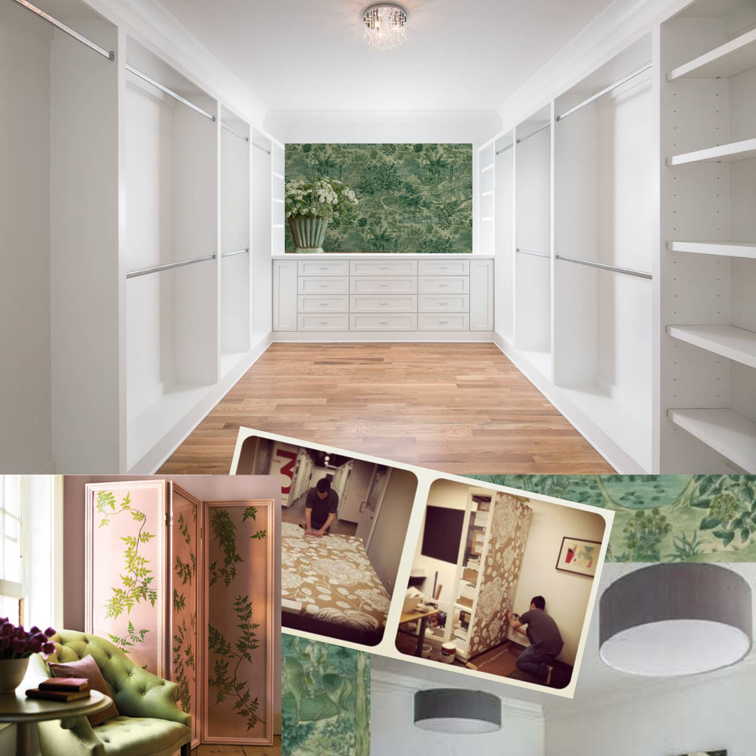
DIY projects for everyone

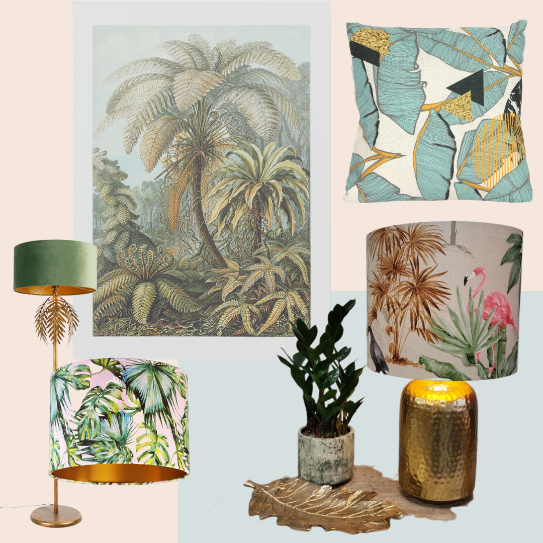
If you don’t have a completely separate room to use purely for dressing and displaying clothes, like most of us in the UK, but want to create a partition between your clothes rail, drying rack and the rest of the bedroom well look no further because wallpaper and a quick DIY weekend job can create a super easy divider that looks a million pounds. All the directions you need here. Or find a used one on Gumtree or eBay and start redecorating!

And do not forget about lampshades. Again, you might be in a flat and can’t possibly think about wallpaper but you love this print as much as I do – it would make an amazing lampshade. What a statement if you go for oversized in your living/dining room or bedroom. Again, this print works with white so this could be a great way to bring a unique touch in. I know this DIY trick has been around for ages. But good ideas are never bad as long as you really go for it and own it as your personal style.
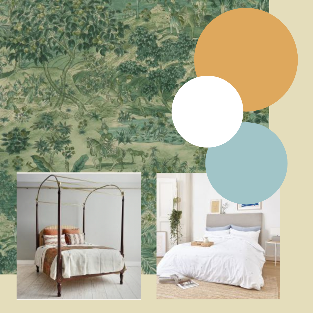
Bedroom

I’m going to suggest moving towards the blue-green tones and adding a rich old orange to add some of that bedroom passion in. Mix this up with beautiful white sheets on a statement bed and you’ll have a room you won’t want to leave.

Paint is from Farrow & Ball: Blue Ground and Archived Orange

This amazing campaign bed is an original from Max Rollitt – again, another antique but if it’s out of budget use it as inspiration. There is a reason these beds are still making an impact and it’s because they were beautifully designed to last.

Good sheets will make all the difference for your sleep as well as make sure your bed is a knock out. I can highly recommend Dip & Dose who “sell the highest quality, sustainably sourced and ethically produced products at a genuinely fair price.” Ultimately good sheets from a company trying to do the right thing. Makes them even better.

Let me know if you end up using this. It seems to be selling out fast so if anyone has dived in for a bit of a Ramayana wallpaper obsession like me I’d love to see the results!

Mint blues and peachy pinks for an LA Art Deco vibe.

Inspired by The Britely, the proven combination of mint blues and peachy pinks can bring a bit of glam to your life.

Livingetc.com just gave us an amazing view into the new the new LA club from the interior designer behind Annabel’s in Mayfair.

Image credit: Ye Rin Mok for The Britely and Livingetc.com

Designed by Martin Brudnizki, the esteemed Swedish architect behind the elegant candy-filled interiors of Annabel’s in Mayfair. He has spread his candy-cotton-colored wand across the Atlantic to create a fantastical tribute to the sparkling streets of West Hollywood. 

Livingetc.com

With travel restrictions on and I’m sure a a mile long waiting list for entry, sadly I won’t be getting a chance to see this in person anytime soon. But I think it’s amazing inspiration for anyone wanting to capture a bit of old school art deco 1930’s glam crossed with West Hollywood. The colour combinations of palms combined with the mint blues and peachy pinks set off by brass detailing make the right kind of statement even if you don’t have access to the LA sunshine.

Art Deco inspiration

I can imagine using this as inspiration for a garden room, patio or conservatory or even a home office to spice up the summer zoom calls. Or like the image below just slightly adjust the peachy pink to a purple tone and the blue to a more teal tone and you’ve got the same vibe perfect for a living room that moves it forward in time but no less special.

Paint combinations to start the transformation

slightly changing the tones can give you your unique take on the combination

Lets start with some great paint colours.

  • Love this peachy pink from Little Greene called Pink Slip and combine with Sky Blue (1)
  • Benjamin Moore for Peach Cloud which will give a lovely subtle radiance glow and work really well with classic colours but I love with Ocean Air to pick up on this art neveau LA vibe (2)
  • Benjamin Moore also has this Palm Beach lovely Pink Peach which will work beautifully with green ferns and punchy mint blues (3)
  • Farrow & Ball have a lovely grown up peachy pink that reminds me of old 1930’s lingerie which they describe as the softest blush of colour. (4)
  • Graham & Brown’s Dee is a super liveable shade which you can’t go wrong with and combined it with Vacation which seems appropriate! (5)

Up the volume with wallpaper

There are some really lovely wallpapers to pick from to bring in the vibe. I’m loving this one from Wayfair, Wellsville by Blue Elephant. which is a peal and stick option that you can take off and reposition without leaving marks – great for flats or for quick changes. B&Q also do a version of this called Banana Leaf Blue/Green Premium Peel and Stick Wallpaper Roll (Covers 45 sq. ft.). Graham and Brown have a more grownup option which errors more towards grey and pink than the blues but would work with existing grey furniture and pink walls along with blue accessories. Cole & Son have an option called Palm Leaves which comes both with a peach background and a blue option.

Bring in the bling

Art Deco was really all about opulent designs mixed with the use of metallic and glazed surfaces. So when approaching this look for those tiny details (or add them yourself). Chairs with bronzed legs for example help pull this concept through. Shell shaped chairs are a simple way to add in that bit of va-va-voom and come in a range of price-points if this is just a short term commitment.

Aldi is currently selling out on their Kirkton House velvet cocktail chair which comes in blue and pink! But if you have a little more cash to spend Oliver Bonas does a beautiful version in multiple colours called the Flora collection with armchairs, headboards and even loveseats. Homesdirect have a very pretty pink scallop tub chair on sale with some classic detailing and the bronzed legs. And Cultfurniture have a lovely bar-stool that brings an Art Decoesque design suitable for this look.

From top left in clockwork order: Aldi, Oliver Bonas, Homesdirect, Cultfurniture

Accessorise for success

Having fun with the accessories is really where this combo sings. Pillows and lights are a simple way to add in the floral tones and brass touches with massive impact. But don’t forget your artwork. Combining new posters with vintage finds helps bring this approach together. This poster from H&M is a great starting point. But look out for complementary items on places like The Sales Room for live COVID19 friendly auctions.

I love this pillow from Qunice and Cook because it brings in the brass accent in an unexpected place. But don’t forget about lamps and lampshades which are an excellent way of bringing in the brass detailing along with a pop of pattern. You may not be able to or want to commit to a banana leaf or fern inspired sofa print but the right set of lamps can do wonders. A set of these bad boys on a side board with some lovely stacked books in between add in the texture and detailing to get the scheme right. And I love this standing light from Lampandlight with the palm tree detailing around the top, just find a unique lampshade to bring the theme and tie it all together. This one from MintandMay depending on the tone of pink could be worth pairing.

What to wear…

For lounging in your new art deco Britely inspired lounge bar at home?:

6 ways to be inspired by sunshine yellow.

Our inspiration is PANTONE Illuminating, one of this year’s spring collection colours and a beautiful sunshine colour to brighten your life.

According to Pantone, Illuminating is a bright and cheerful yellow sparkling with vivacity, a warming yellow shade imbued with solar power. Generally yellows like this fall into the zone of being considered friendly, joyful and optimistic. Think about how a sunny day makes you feel. And let’s face it, with April showers on the horizon and little sunshine added to our homes can’t go amiss. 

Paint choices

For my two cents, #2 is closest to PANTONE illuminating

All of these have that something extra, some are more buttery and some have a tad more orange but they will all add some lovely brightness to your rooms.

  1. Little Greene:  LEMON MIVVI
  2. Little Greene:  TRUMPET
  3. Farrow & Ball:  Yellowcake
  4. Mylands: Pilmlico No. 136
  5. Benjamin Moore:  Sunshine 2021-30
  6. Sherwin-Williams:  Cheerful

Colour matching

A strong sunshine yellow needs to be used in a considered way, especially if you choose it to be your primary or dominant colour in the room as it can be a little exhausting on the eye. So make sure you take Pantone’s advice and balance this intense colour with soothing greys or creamy whites.

PANTONE love to pair their Illuminating with their Ultimate Gray, “the colour of pebbles on the beach and natural elements whose weathered appearance highlights an ability to stand the test of time, Ultimate Gray quietly assures, encouraging feelings of composure, steadiness and resilience.” In other words, grey and yellow go really well together and balance each other.

Or balance it with a lovely soft purple, pale pink or pale blue or use black accents to really highlight it (be careful you don’t end up going too far with this and turning your house into a sudo wasp nest!). Are you feeling a bit frisky? Then accent with a punch by adding hot pink into the mix. Not for the faint-hearted, but it can create a wow moment.

Sunshine yellow and navy has always been a classic combination but be careful you don’t end up looking like an Ikea logo. Personally, a yellow living room would create too much anxiety for me; however, navy walls with a fabulous sunshine yellow sofa would be a relaxing but powerful combination. Or think about wallpapers. Sunshine yellow could still adorn your walls but broken up within a pattern creates a more playful space.

Wallpaper delights

A few of my fav sunshine yellow adorned wallpapers:

Clockwise from the top left Kukkai, Trio, Chrysanthemums Yellow, Hencroft Punch
  • Kukkai in Sunshine from wallpaperdirect.com – simple but effective flower pattern.
  • MADE’s wallpaper Trio, which is currently (as of when I posted this) on sale, which is always a bonus.
  • I love the pink and green of the flowers against the sunshine yellow in this print called Hencroft Punch from Little Greene.
  • This paste-less wallpaper can be put on apartments and removed easily – uniquely, it’s a beautiful image of a sunshine yellow flower – a great way to add a special touch to a space that you might not have too much control over.
  • And for something quite unique, I love this wallpaper from Mind-the-Gap (even better, this eclectic wallpaper brand is from Transylvania, which sparks all sorts of images for me!) Chrysanthemums Yellow Wallpaper.

But if committing to yellow walls as a dominant colour or even a front door is just too much, you can still add a little sunshine into your life.

Mix with accessories

Graham and Green pillow, NEXT pom edge pillow, Dunelm flower pot

DIY delights

And don’t forget the simple but incredibly effective DIY project using fabulous sunshine yellow spray paint and getting to work on an old lamp or even metal garden furniture to refresh your patio. Don’t be afraid of spray paint as a project. There are some great tips here for getting it just right.  But adding yellow will really brighten up a dull space.

What to wear?

Once done, don’t let that new garden or patio set designed to bring a little life back into the space to waste. We might not be planning our European vacation just yet, but we can still plan on doing some sunbathing on the balcony and in this little number from H&M, you won’t be able to be anything but happy! As the flight upgrade won’t necessarily be required, spending a bit of your hard-earned wages on this coverup dress from Beach Cafe to give you a perfect holiday abroad vibe. And for when the late evenings start to close in and a chill grows in the air throw on your Gucci beautiful wrap sweater.