Blue bedrooms and your happiness factor x 4.

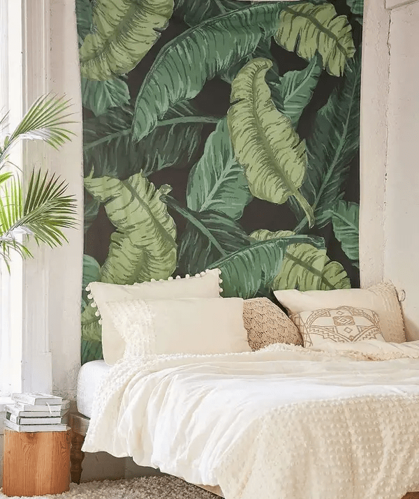
For the love of power blue, here are four inspirational bedroom interiors and a few suggestions to get your started on a good nights sleep. 

Experts from Bed Threads have recently completed a study that shows people who sleep in blue bedrooms get the most sleep and, lucky for them, wake up the happiest because, according to the study, the ‘happiness receptors’ in human eyes are very sensitive to blue. 

Not sure about happiness receptors, but scientists know that blue has a shorter wavelength which tends to make us calm, whereas colours with longer wavelengths such as yellow, orange and red make us more alert. And feng shui practitioners associate blue with peace, clarity and healing, often linked with spirituality.

Good news for us because we all love blue. A YouGov survey conducted in 10 countries across four continents found that blue is the most popular colour across the board. 
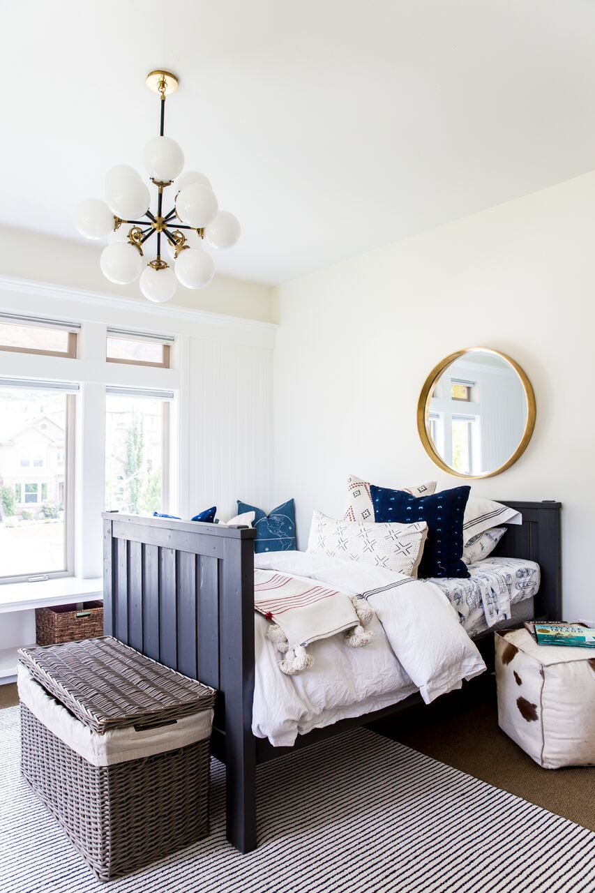
1.) Blue on white

I’m assuming you’ve binged on Dream Home Makeover featuring Studio McGee? If that’s not the case, I’m also giving you an extra tip – do. They’ve nailed the practice of peaceful neutral rooms combined with pops of rich colour and natural materials.

Can’t or don’t want to paint? Here they showcase how to add blue through your choice of furniture and accessories. I’m sure I’m not sharing anything inspirational here when I say the trick to any amazing bedroom will always ultimately come down to the bed. Don’t scrimp if you can on this key element because according to Dreams, “the average person spends about 26 years sleeping in their life, which equates to 9,490 days or 227,760 hours.”  

Get started:

This double painted oak frame from Chiltern Oak Furniture would be a great starting point to duplicate this approach with a very reasonable price point.

2.) Simplicity at its best

This second bedroom I love for its purity. What a simple design life hack. Take a chair that you can pick up for very little on Gumtree or eBay and paint to match your walls to create a lovely side table. Just make sure that you find one that has the right shape. The curves of this one soften the starkness of the overall design. 

Get started:

Linen sheets are exceptional to sleep in. And what’s even better is that you don’t have to worry about ironing them to have them look fabulous! Loaf do some beautiful linen dyed into soft colours.

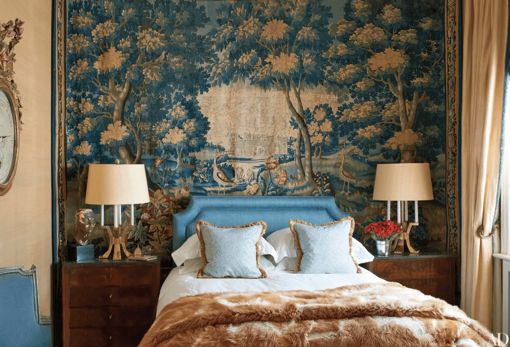
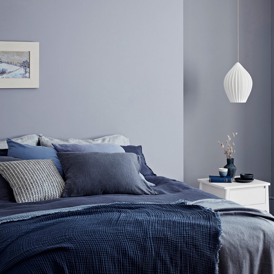
3.) Panelling can never be bad

Hands up, I love panelling, and I will always try to include an example. Don’t let panelling intimidate you. It’s actually not that hard to find good suppliers or even do it yourself. I spent a week and £250 on MDF and paint to create a great panelled hallway which fundamentally changed my flat.

But back to this, what is lovely is the use of a blue-grey wall paint across everything with then a pop of peacock blue in the headboard to turn this from something safe into something quite exciting.

Get started:

Interested in a fast and straightforward solution for panelling, then check Cut/mypastic out. They cut your MDF wall panelling to size, making it so much easier to install without the hassle of having to cut all the pieces yourself. 

4.) Denim Dreams

Crown Paints are trying to showcase their wall colour in this image, and as such, the focus is on the walls, so I’d style this room differently, i.e. that picture above the bed is the first thing to go. However, overall I think the concept is excellent.

Double Denim isn’t just a fashion statement; it’s now your new blue bedroom statement. I can see this working well for people with kids or dogs who want something a little more sturdy for pillow fights or jumping games.

Get started: 

Check out Etsy for some fantastic handmade denim pillows such as these. 

Some lovely blue paints to get you started:

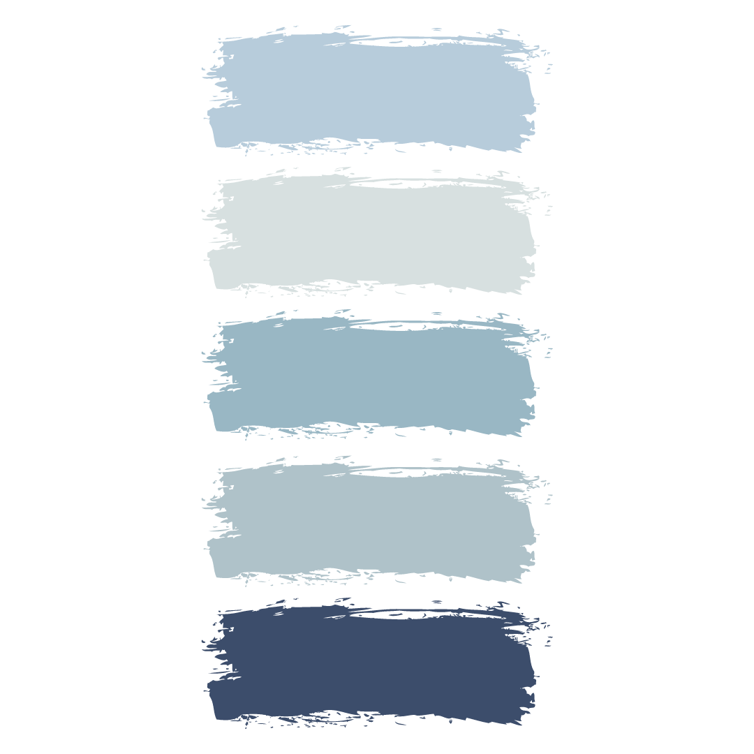
  1. Little Greene has a lovely paint colour called Pale Wedgwood
  2. Benjamin Moore have a super soft shade of blue called Iceberg perfect for master bedrooms.
  3. Lick has a lovely mid blue grey which as they say has a “Hamptons” sort of feel to it.
  4. Farrow & Ball have in their California Collection a soft foggy blue called Hazy
  5. Graham & Brown have a lovely navy colour called Brave for accent pieces or to repaint a bed.

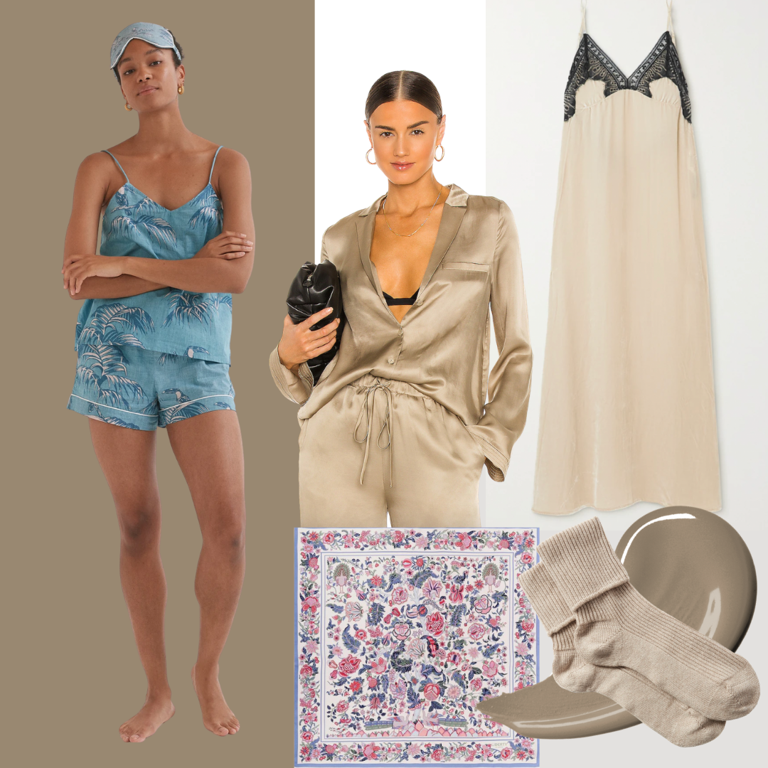
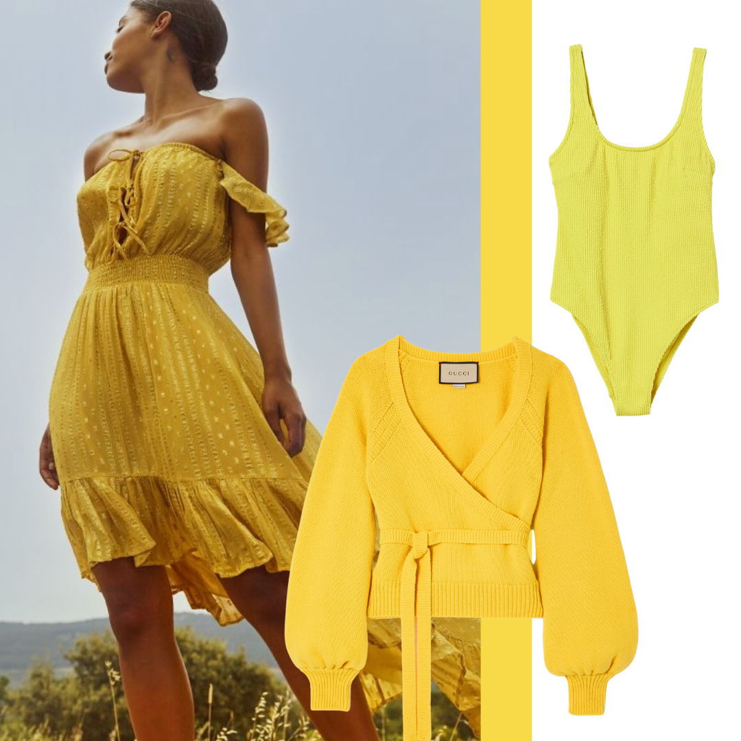
Conclusion & fashion highlight

Blue bedrooms will always have a place in our hearts. Using softer pastel tones will keep the room calming and nurturing and allow you to layer more depth through the use of linens and pillows.

But don’t forget, as we always want to look our best we decided that the playsuit was the perfect accompaniment when hanging out in our new fabulously blue bedrooms.

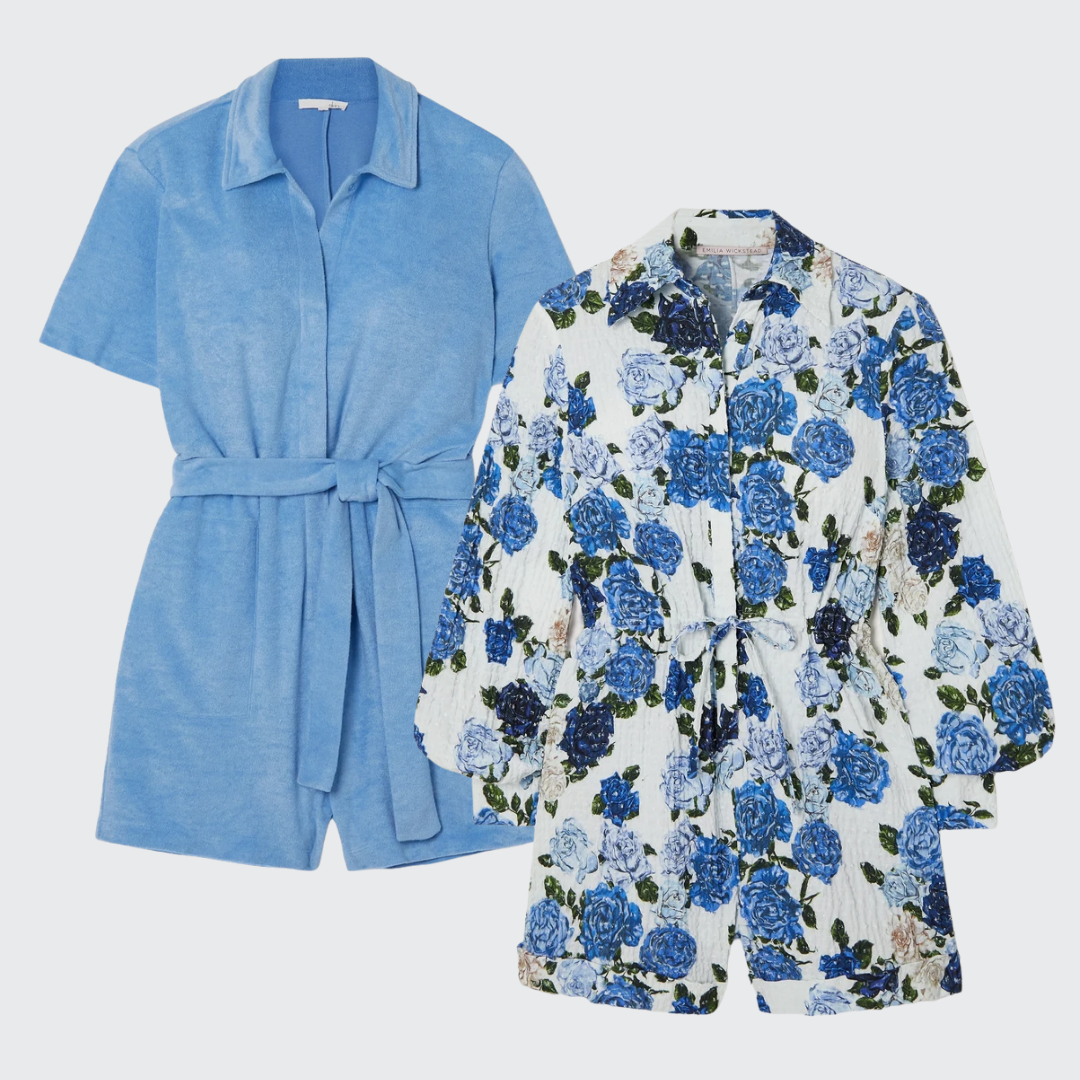
Emilia Wickstead makes this amazing Blanche floral-print Swiss-dot cotton-blend seersucker playsuit

and SKIN makes this Mags belted cotton-blend terry playsuit in blue.

Both from Net-A-Porter.

Advice

I will often repeat a few guidelines because inspiration is only as good as the room you have to decorate! Make sure you test everything in the room you are decorating.

A.) Suppose you are doing a wallpaper and paint combo. In that case, you must take a sample of the paper and pin it up to 1.) make sure you love it in your room and 2.) test the paint colours next to it. If you are looking at dropping a lot of money on the wallpaper, then, if possible, try to get a cutting for approval (CFA) of the current dye lot, i.e. the one you’ll be putting up because wallpaper can often vary across lots. 

B.) Colour tester pots are your saviour. You need to see the colour in your room with your light and space before making your final choice and definitely before you paint the room! Please don’t skip this step. The little example on the colour card or even on screen if you’re using an app to test a colour can be significantly different at scale or natural light. Save yourself the hassle of having to repaint. 

Follow my blog with Bloglovin

Image Credits: https://studio-mcgee.com/, Mikael Axelsson for Fantastic Frank, https://biid.org.uk/listed-islington-master-suite, https://www.crownpaints.co.uk/, Net-a-Porter

Mix Brave Ground and tapestry to create a warm and inviting space.

Discover the do’s and don’ts of the latest tapestry trend when combining it with the new Dulux colour, Brave Ground

It’s not surprising that Dulux has picked a strong simple colour that creates a solid basis for people to start exploring their creativity to be their pick of the year. Described as a “cornerstone” colour, it is a beautiful base that will allow other elements to shine.

Dulux Brave Ground

As we spend more time than ever in our homes, many people are starting to think about the colours and design that surround them. ‘This is the mother earth of colours, it’s organic, familiar and versatile,’ says Marianne Shillingford, Creative Director at Dulux UK. ‘It’s also trustworthy and supportive of all the other colours in the spectrum.’

What I love is that you can start from a colour that’s rich and warming rather than a cold white or a yellow magnolia. It immediately provides a base layer that takes it up a notch. Like a great foundation that doesn’t require you to add anything else to look fabulous.

I’d recommend painting the skirting and ceiling coving/cornice if you have it as well to give the room height and really ground the space with this colour before making sure you’ve got lots of lush green plants which will really pop the colour.

After a little light dreaming of a world of Brave Ground, I recently noticed this article in the FT on the use of tapestry as one of the latest tricks in the interior design bag.

What a perfect match for this earthy base colour. The use of blues, greens and gold in older antique tapestries would be beautiful against this lovely rich tone.

The do’s and don’ts of tapestry

But to be fair, I’ve also read articles which tell you never ever hang a tapestry and especially don’t do it behind your bed. I don’t disagree, but think there are a few suggested rules that make all options work.

Yes, I know normally there are no rules but tapestry can be one tiny step away from a slippery slope into tacky land or dusty & musty so it’s worth keeping these in mind.

  1. The trick is to go less functional but instead think about them almost like modern art. Layering and adding texture. You don’t want to look like you’ve stepped into a strange recreation of a shakespearean play in your home. That would be a tragedy (boom boom).
  2. Do not hang anything that has any hint of looking like something from a teenage or university dorm room. No mystic meg type hangings with moons, sun and stars. If there is an ounce of anything that looks like a tarot card move away. Far away. Pretty much anything they call a tapestry on Amazon.
  3. They don’t have to go on the wall.

Bedroom + tapestry

Bedrooms can be a great area where almost all kinds of tapestry can create a soft welcoming space the exception being to always remember suggested rule number two. Added bonus they also can add a layer of sound dampening to your room that makes that room a little more snug when you’re sleeping or trying not to make another phun, making noise…. (I feel like I should be adding an emoji at this point but will refrain).

Any of these tapestries in the picture below would create a really inviting space using Dulux Brave Ground as your base wall colour. A dramatic drop of fabric behind can also work as a headboard if you’re missing one. Layer up with co-ordinating pillows for a grand affect.

When a wall won’t do…

Now we should all be so lucky to have a room this large! But inspiration can be taken from this skylit Las Vegas living room by design firm Atelier AM. They’ve taken a beautiful tapestry and draped it over a square large coffee table for dramatic effect. Simple but effective way to use a tapestry or all kinds to hide an ugly but useful sized coffee table or one that has seen better days and make a statement piece out of it. Just make sure the material you use is the right weight – too light and it will just look like a strange tablecloth – make sure it feels heavy and hangs with purpose.

What to wear when surrounded by Brave Ground and tapestry?

And while you are hanging out in your new luxury abode don’t forget to make sure you’re doing to you best to look fabulous in your lounge wear!

Desmond & Dempsey have a number of luxury cami tops and short sets including one in this lovely Bocas Print Blue print. Net-a-porter has some delicious ribbed cashmere socks by Johnstons of Elgin which will keep you toasty warm even when wearing the Freya open-back lace-trimmed velvet midi dress by Sleeping with Jacques. Or shine against the backdrop in this beautiful Leila Pajama shirt by Weekend Stories. Or need to tie your hair back while in a vintage convertible travelling across to your bedroom at your Cotswolds Estate (well you get the vibe, it might just be on a borris bike to your spin class before returning to crash!) then a Liberty scarf is a must have for all of our collections.

Left clockwise: Desmond & Dempsey Bocas Blue, Weekend Stories shirt, Sleeping with Jacques nightgown, Johnstons of Elgin socks, Liberty scarf

6 ways to be inspired by sunshine yellow.

Our inspiration is PANTONE Illuminating, one of this year’s spring collection colours and a beautiful sunshine colour to brighten your life.

According to Pantone, Illuminating is a bright and cheerful yellow sparkling with vivacity, a warming yellow shade imbued with solar power. Generally yellows like this fall into the zone of being considered friendly, joyful and optimistic. Think about how a sunny day makes you feel. And let’s face it, with April showers on the horizon and little sunshine added to our homes can’t go amiss. 

Paint choices

For my two cents, #2 is closest to PANTONE illuminating

All of these have that something extra, some are more buttery and some have a tad more orange but they will all add some lovely brightness to your rooms.

  1. Little Greene:  LEMON MIVVI
  2. Little Greene:  TRUMPET
  3. Farrow & Ball:  Yellowcake
  4. Mylands: Pilmlico No. 136
  5. Benjamin Moore:  Sunshine 2021-30
  6. Sherwin-Williams:  Cheerful

Colour matching

A strong sunshine yellow needs to be used in a considered way, especially if you choose it to be your primary or dominant colour in the room as it can be a little exhausting on the eye. So make sure you take Pantone’s advice and balance this intense colour with soothing greys or creamy whites.

PANTONE love to pair their Illuminating with their Ultimate Gray, “the colour of pebbles on the beach and natural elements whose weathered appearance highlights an ability to stand the test of time, Ultimate Gray quietly assures, encouraging feelings of composure, steadiness and resilience.” In other words, grey and yellow go really well together and balance each other.

Or balance it with a lovely soft purple, pale pink or pale blue or use black accents to really highlight it (be careful you don’t end up going too far with this and turning your house into a sudo wasp nest!). Are you feeling a bit frisky? Then accent with a punch by adding hot pink into the mix. Not for the faint-hearted, but it can create a wow moment.

Sunshine yellow and navy has always been a classic combination but be careful you don’t end up looking like an Ikea logo. Personally, a yellow living room would create too much anxiety for me; however, navy walls with a fabulous sunshine yellow sofa would be a relaxing but powerful combination. Or think about wallpapers. Sunshine yellow could still adorn your walls but broken up within a pattern creates a more playful space.

Wallpaper delights

A few of my fav sunshine yellow adorned wallpapers:

Clockwise from the top left Kukkai, Trio, Chrysanthemums Yellow, Hencroft Punch
  • Kukkai in Sunshine from wallpaperdirect.com – simple but effective flower pattern.
  • MADE’s wallpaper Trio, which is currently (as of when I posted this) on sale, which is always a bonus.
  • I love the pink and green of the flowers against the sunshine yellow in this print called Hencroft Punch from Little Greene.
  • This paste-less wallpaper can be put on apartments and removed easily – uniquely, it’s a beautiful image of a sunshine yellow flower – a great way to add a special touch to a space that you might not have too much control over.
  • And for something quite unique, I love this wallpaper from Mind-the-Gap (even better, this eclectic wallpaper brand is from Transylvania, which sparks all sorts of images for me!) Chrysanthemums Yellow Wallpaper.

But if committing to yellow walls as a dominant colour or even a front door is just too much, you can still add a little sunshine into your life.

Mix with accessories

Graham and Green pillow, NEXT pom edge pillow, Dunelm flower pot

DIY delights

And don’t forget the simple but incredibly effective DIY project using fabulous sunshine yellow spray paint and getting to work on an old lamp or even metal garden furniture to refresh your patio. Don’t be afraid of spray paint as a project. There are some great tips here for getting it just right.  But adding yellow will really brighten up a dull space.

What to wear?

Once done, don’t let that new garden or patio set designed to bring a little life back into the space to waste. We might not be planning our European vacation just yet, but we can still plan on doing some sunbathing on the balcony and in this little number from H&M, you won’t be able to be anything but happy! As the flight upgrade won’t necessarily be required, spending a bit of your hard-earned wages on this coverup dress from Beach Cafe to give you a perfect holiday abroad vibe. And for when the late evenings start to close in and a chill grows in the air throw on your Gucci beautiful wrap sweater.